Branding Case Study – Patagonia – Part 2/2
In the first part of my Patagonia case study I went over the company’s history and a brief definition of branding. Now, let’s go over the main concepts of brand visuals, coherence and recognition.
Patagonia through Visuals
Over time, Patagnia’s logo followed the exact strategy of Yvon Chouinard: stripping off what was not essential.
In the beginning, the logo was right on with the trends of the 1980’s: simple and clear, a name and a background. The typography of the word patagonia is noticeable while extremely simple : no capital letters, just a bold name: patagonia. The background is there to remind us of Yvon’s core passion: the mountains (under a sunset/sunrise). The logo express exactly what the brand is, and it puts the product into the customers’ mind.
Over time, with the Patagonia name getting well known, the background could go away as the name was speaking for itself. The mountains were taken off the logo leaving only the essential : the name.
The imagery on the website is also in line with the brand.
Clear, simple, easy to navigate, the website is a perfect translation of the identity of the brand. You can watch sports clips, enjoy beautiful imagery and you basically get a visual experience while Patagonia transports you into its own world.
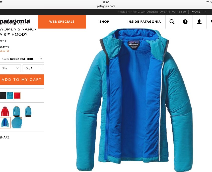
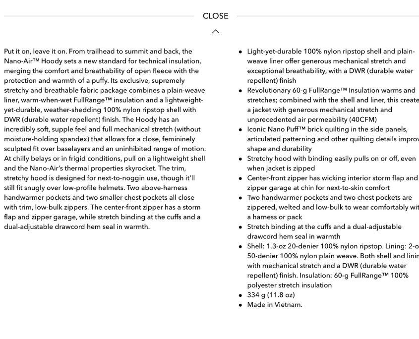
Not only the visual experience is perfectly calculated and exploited by Patagonia, but the shop makes you secure as a customer. Everything is transparent, you know everything about your clothes: what material was used and why. You know the functionalities of the product, the weight of the fabric, where it is produced (not only the country but the factory itself). You can watch a video illustrating all of these points, showing you the advantages of the product and how you can use it. Patagonia gives you a clear explanation of what the product is, how it is made and what is the optimal use of that product. You know what to expect, you have all of the information on hand not to do an impulsive buy.
Patagonia brand coherence
The brand coherence is based on the values and keywords of the company. This has to pass on through advertisements, the product itself and the PR of the brand.
As mentioned in our previous article Patagonia brand focuses on three core values: Quality, Perfection, and Environmental (bringing less harm to the environment by helping their customers make informed buying decisions and avoid exaggerated consumption)

The “Don’t buy this jacket” campaign in 2011, initiated a growth of sales of 40% for the following 2 years. This campaign which is visually very simple and clear is also very strong in terms of message. It created a controversy because of the contradiction of the message and the use of an advertisement to broadcast the message. This was very provocative: a clothing company, who is retailing and whose aim in the end is to earn money, is asking its customers not to buy its own products. This was followed by two kinds of reactions: total rejection (from non customers) of this advertisement thinking it is pure hypocrisy, and total adherence (from loyal and potential customers) because the message was in line with the set of values of the company and its customers.
Not only the logo and the visual communication of Patagonia are well orchestrated, the communication around the product is too.
There is a complete transparency around the garment and its production. Why this garment is produced, why it is done this way and who produced it (they even list their factories!)
This level of transparency is also relevant in the engagements taken by Patagonia. Each year they give 1% of their profits to the Planet and also unveil all of their code of conduct shared by their different factories. Not only that their policies and processes are transparent, but also traceable.
Patagonia recognition
With all of these details, Patagonia built a brand which is recognisable visually and not only. The message is well spread and also understood. Yvon Chouinard created a brand which has a unique, simple and identifiable message. Through Patagonia branding, Yvon Chouinard built trust and loyalty around his product.
Patagonia is an example of not only a company success but also of a very good branding strategy. You’ll be better recognised if your brand has a meaningful message that your target market can identify with. If you have no message to share or if it is not clearly expressed, you’ll become yet another designer in the vast fashion industry. That is exactly what you have to fight against.
This article was written by Alexandra, fashion consultant. Follow her on Twitter @Stylindublin


